Concept
A website design for a Bike rental company.
Goals
Design a clear, user-friendly website that showcases a visual hierarchy, intentional navigation features and a seamless experience across devices.
Duration
1 Week
Colour Pallet
#4F6B76 - Slate blue-grey to bring a calming colour - a nod to the many cobblestoned streets of Edinburgh.
#E5B37B - Warm Sand to add energy and earthy tones - boosting the idea of adventure.
#FFFFFF - Putting white in the design to increase readability and accessibility.
Why?
To provide contrast, visual harmony, and a subtle nod to both urban and natural environments.

Typography
Montserrat, Bold, 48px
Montserrat, Semi Bold, 40px
Montserrat, Medium, 28px
Montserrat, Regular, 24px
Consistency: Using one font across all text creates a more cohesive look.
Clarity: Each level is visually distinct, helping users understand page structure quickly, which aids usability.
Accessibility: Montserrat is bold, geometric, and highly legible.
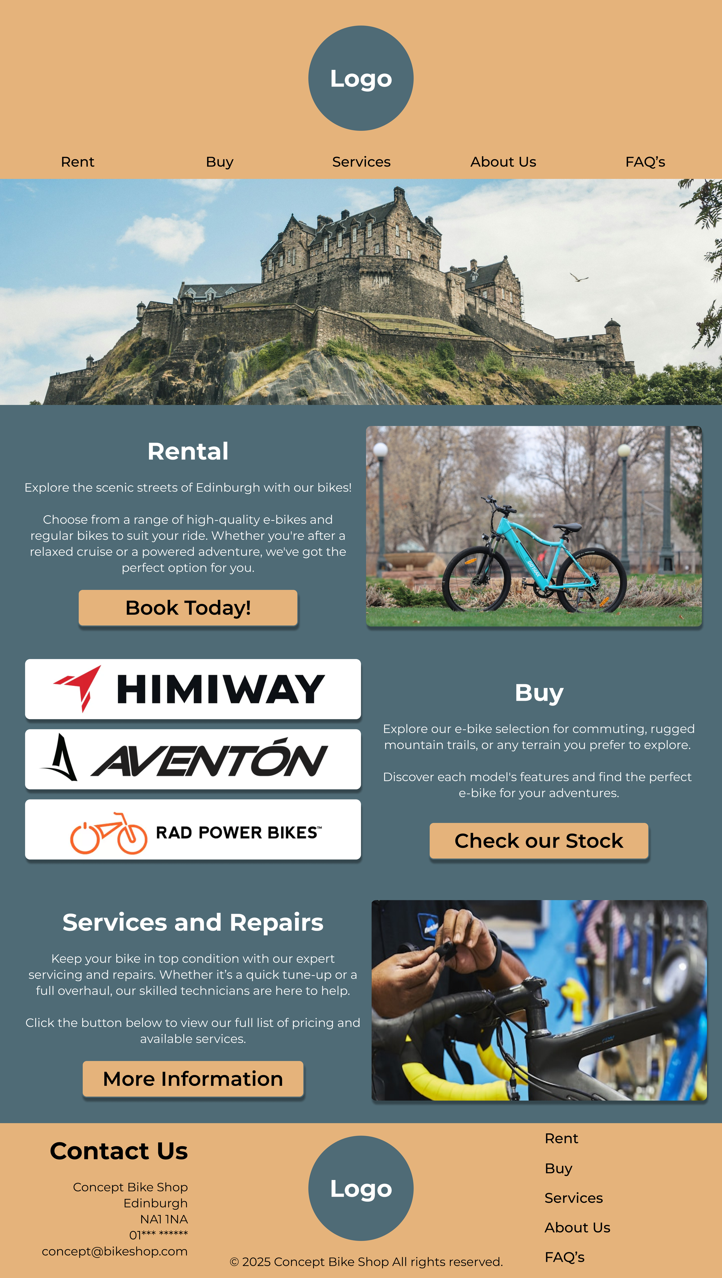


Responsive Design
I needed to ensure I built a responsive website which would automatically adapt to any screen size to make sure the content looked great and works seamlessly on any device.


Call to Action
I’ve included clear call-to-action buttons to guide users to take key actions and make it easy for them to take the next step.


Clarity
I've kept the content clear and focused to help customers quickly find what they need and navigate the site with ease.